Match Paint Color: A Practical DIY Guide
Master color matching for walls, cabinets, and cars with a practical, step-by-step method, essential tools, and expert tips from PaintQuickGuide.

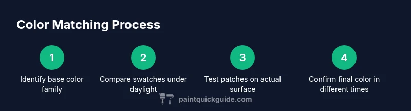
To match paint color accurately, begin by identifying the base color and undertones, then compare multiple swatches under neutral lighting. Apply small test patches on the actual surface and observe in daylight before committing. Gather swatches, tester cans, a color chart, and a clean applicator to ensure a reliable match.
What 'match paint color' means in practice
Color matching means selecting a paint shade that looks the same as a reference sample when viewed on the same surface under the same lighting. For homeowners and DIY enthusiasts, the practical goal is to minimize visible differences across walls, furniture, or car panels. The task is not about achieving an exact numeric value; it's about achieving perceptual similarity. In practice, you compare multiple swatches, test patches on the actual surface, and verify under daylight. The PaintQuickGuide team found that the biggest errors come from comparing swatches in showroom lighting or under warm lamps. Those lighting conditions can shift hues and undermine your decision. Start by noting the base color family (white, beige, gray, blue, green, or brown) and the undertones (yellow, pink, blue, or green). Then gather several shades from that family so you can evaluate subtle differences side-by-side. Keep a simple log of each tested shade, including where you tested it and what time of day you viewed it. This habit helps you avoid rework and keeps the process transparent.
Understanding undertones and lighting
Undertones are the hidden hues that influence how a color reads beside other colors. A gray can carry warm yellow undertones or cool blue ones, changing how it looks on different surfaces and in different lighting. Lighting quality—its color temperature, brightness, and even the time of day—drives perception far more than most people expect. To minimize surprises, compare swatches under neutral daylight-balanced lamps (roughly 5000–6500K) and, when possible, outdoors in shade. If a swatch shifts hue across lighting scenarios, flag it as an undertone concern and sample several shades within the same family. The PaintQuickGuide analysis indicates that testing at least three candidate shades under multiple lighting conditions yields more reliable results than a single comparison. This practice reduces the chance of choosing a color that appears right only in one setting.
Tools and methods to match color
A physical color deck (fan deck) with undertone variations is your primary baseline. Digital color meters and smartphone apps can be helpful clues but are not substitutes for real-world testing. Patch-testing remains essential: apply tiny chips on the actual surface using the surface finish you plan to use (matte, eggshell, satin, or gloss). When possible, test in the same room and on the same wall where the final project will occur. Keep notes or photos to document how each shade looks under daylight, artificial light, and in the evening. For complex jobs—like matching historic interiors or auto finishes—consider collaborating with a color-matching service, but always verify with your own tests. PaintQuickGuide’s guidance emphasizes a disciplined workflow with consistent lighting and documented results.
Reading swatches and choosing a baseline
Swatches are best understood when placed side-by-side on the same background and oriented under the same light. Start with a baseline color family (grays, beiges, or warm whites) and select at least three shades within that family. Look for undertones that cancel each other out when placed next to a neutral surface. Organize swatches from coolest to warmest and label each with its undertone note. If the board or wall you’re matching has existing furniture or trim, include those elements in your comparison. This context helps prevent choosing a shade that clashes with surrounding colors and finishes. Remember to document which shade was the closest in daylight and which showed the least color shift under artificial lighting.
Matching color for walls, trim, and cabinets
Walls typically require broader, softer colors that read well from a distance, while trims and cabinets benefit from slightly crisper, contrasting tones. When matching walls, test with large patches on the intended surface and observe how they interact with natural light and adjacent colors. For trim, you can push toward cooler whites or warmer off-whites for subtle contrast. Cabinets often need a color that tolerates fingerprints and wear; test with a small panel that simulates finish wear over multiple days. If you’re unsure about sheen, compare the same color across finish levels (matte, eggshell, satin) to ensure uniform perception across surfaces. For every scenario, keep a clear record of the final chosen shade and the rationale behind it.
Color matching for car painting and auto refinishing
Auto color matching adds complexity because automotive finishes include basecoat and clearcoat layers, potential metallics, and different lighting environments (shop lighting vs. daylight). Always check the original factory color code if available and verify with a dedicated automotive paint deck. Test on a small, inconspicuous panel under both shop lighting and daylight, then compare in a neutral environment. Be mindful that car paints may appear different on curved surfaces due to gloss and reflections; apply test panels on representative contours to gauge how the color shifts. If the shade doesn’t align, request a re-tint before committing to a full repaint.
Step-by-step workflow to match color in your project
- Define the base color family and undertone goals. 2) Gather a 3–5 swatch set and a neutral testing surface. 3) Clean the surface and apply a thin, even patch. 4) Compare patches under daylight and neutral artificial light, recording impressions. 5) Narrow to two or three finalists and perform full-surface patch tests. 6) Choose a final shade and verify across lighting conditions after 24 hours for consistency. 7) Document the final choice with photos and notes for future touch-ups. 8) Apply the color plan to the full area and monitor for changes over time. 9) Revisit at different times of day to confirm stability.
Common pitfalls and how to avoid them
One common pitfall is relying on showroom lighting, which skews color perception. Always test in the intended environment with neutral lighting. Another mistake is ignoring undertones; a color may look right on a chip but read differently on your surface. Always test multiple shades within the same family and document results. Avoid rushing the process; even small differences can be visible in large surfaces. Finally, don’t overlook sheen and texture; the same color on a flat card can appear different on a wall with texture or on glossy cabinetry.
Finishing touches: lighting, sheen, and verification
Even after you select a color, lighting throughout the day matters. Recheck the color under morning, midday, and evening light. Also ensure the sheen matches the surrounding surfaces, as mismatched finishes can highlight color differences. A final coat with a compatible finish can hide minor discrepancies; test on a small patch before committing to the entire project. Documentation and photos are invaluable for future touch-ups or rematches. When in doubt, allow for a slight margin of shade variance and adjust with a final glaze if needed.
Tools & Materials
- Color swatches/fan deck(Full set including undertone variations)
- Paint testers/samples (2-3 oz each)(Multiple shades within the target family)
- Painter's tape(Medium width for clean edges)
- Neutral testing surface (white card)(Flat, clean background for swatches)
- Soft-bristle or foam brush(Use a consistent application method)
- Neutral daylight lighting (5500K-6500K)(Simulates daylight conditions)
- Notepad and pencil(Log observations and times)
- Camera or smartphone(Document patches for comparison)
- Marker or label pen(Label swatches with shade info)
Steps
Estimated time: 1-2 hours
- 1
Define base color family
Identify the broad color family (white, beige, gray, blue, green, brown) and the undertones you want to emphasize or neutralize. This gives you a starting point for selecting candidate shades.
Tip: Write down the target undertone and finish before touching swatches. - 2
Arrange swatches under neutral light
Place 3–5 swatches from the chosen family on a white card. Use your daylight lamp or position near a window to compare side-by-side under consistent lighting.
Tip: Keep the light source steady for at least 15 minutes before judging. - 3
Prepare the surface
Clean the surface to remove dust, oils, and residues. If painting over glossy finishes, scuff slightly with fine sandpaper for better adhesion.
Tip: Let the surface dry completely before patch testing. - 4
Apply test patches
Use a small brush or roller to apply thin, even patches on the surface. Allow each patch to dry to the same finish as the final coat.
Tip: Label each patch with shade name and date. - 5
Evaluate under multiple conditions
Revisit patches under daylight, cool-white, and warm-white lighting, noting any color shifts or undertone changes.
Tip: Take photos at each lighting condition for reference. - 6
Narrow to finalists
Choose 2–3 shades that most closely match under all lighting. Consider how they look next to adjacent colors and on the actual surface texture.
Tip: Prefer slightly lighter shades if the color looks too dark in artificial light. - 7
Finalize shade and plan a full coat
Select the final shade and prepare for a larger application. Confirm finish (matte, eggshell, satin, gloss) that matches nearby surfaces.
Tip: Order extra tester cans to do a full-wide patch if possible. - 8
Document and seal the decision
Record the chosen shade, finish, brand, and lot number for future touch-ups. Store swatches in a labeled sleeve.
Tip: Include environmental notes (lighting, room) in the log.
Your Questions Answered
What is the first step to match paint color?
Begin by identifying the target base color family and undertones. This sets the direction for selecting candidate shades and avoiding tone mismatches.
Start by choosing the base color family and the undertones you want. That gives you clear candidates to test.
Can digital color meters replace swatches?
Digital meters are helpful for guessing, but swatches and real patch testing on the surface are essential for accuracy due to lighting and texture effects.
Digital meters help you guess, but you still need real swatches and tests on the actual surface.
Will lighting affect color matching?
Yes. Lighting dramatically changes how color appears. Always test under daylight and neutral artificial light to confirm a match.
Lighting changes color perception, so test under daylight and neutral light.
How long does a color match last?
A color match can last as long as the finish and surface hold up. Re-test after cleaning or repairs to ensure continued accuracy.
A match lasts as long as the finish; re-test after wear or cleaning to be sure.
What if the color fades after painting?
Reassess under the same lighting conditions and consider re-coating with a slightly different shade or finish to correct the illusion.
If it looks off after painting, re-test and adjust shade or finish accordingly.
Is it necessary to match sheen as well as color?
Yes. Sheen affects how color reads; ensure the final sheen matches surrounding surfaces for a cohesive look.
Sheen matters as much as color. Match the sheen to nearby surfaces.
Watch Video
Quick Summary
- Identify base color and undertones before testing.
- Test patches on the actual surface under multiple light sources.
- Document results to prevent rework.
- Choose a shade that reads well with adjacent colors.
- Verify sheen and finish compatibility with surroundings.