Can You Get a Paint Match from a Picture? A Practical Guide
Learn how to match paint colors from a photo, understand the limits, and apply best practices for reliable color matching in DIY and auto refinishing with guidance from PaintQuickGuide.

You can often derive a close starting point for a paint match from a photo, but exact matches are unlikely due to lighting, camera, and display differences. This quick guide explains limits and steps to improve reliability, including reference cards, calibrated devices, and testing with swatches. It also covers digital methods, in-person testing, and when to trust a store mix or custom shade.
Why color matching from a photo is imperfect
According to PaintQuickGuide, color matching from a photo is a best-effort method heavily influenced by lighting, white balance, and display color. The common question, can you get a paint match from a picture, is answered with a nuance: you can derive a close starting point, but an exact shade in paint is unlikely without physical verification. In 2026, the PaintQuickGuide Team emphasizes that a photo is a guide, not a final specification. Treat it as a reference you test against real swatches.
Color reproduction hinges on several variables: lighting temperature, the camera sensor's color response, JPEG/SRGB processing, and the surface underneath the paint. Shadows can shift hue, reflections can wash out detail, and the finish (matte, satin, gloss) can alter perception. A well-structured workflow reduces these gaps, but never eliminates them completely. The goal is to get a trustworthy starting point for swatch testing rather than a guaranteed recipe.
The role of lighting and white balance
Lighting is the biggest wild card in photo-based color matching. Daylight between 5000K and 6500K tends to render colors most faithfully, while warm indoor lights (tungsten) shift hues toward yellow or orange. White balance settings on cameras try to neutralize that, but they’re rarely perfect in real-world scenes. For can you get a paint match from a picture, expect some drift when comparing photos to an actual paint chip. Always aim to photograph under consistent, neutral lighting and use a white balance card to fix the scene before making judgments. This minimizes color shifts that can mislead you later.
Camera sensors and color profiles
Different cameras interpret colors differently. RAW shooting preserves more color data than JPEG, but still requires careful white balance and color profiling. Color spaces like sRGB are common for online viewing, while Adobe RGB can capture a wider gamut. When you’re working from a photo to a paint formula, your best bet is to normalize the image using a calibration workflow that includes a reference card and, if possible, a color-managed workflow on a computer. This reduces the discrepancy between on-screen swatches and charged paint chips.
Reference tools you can use
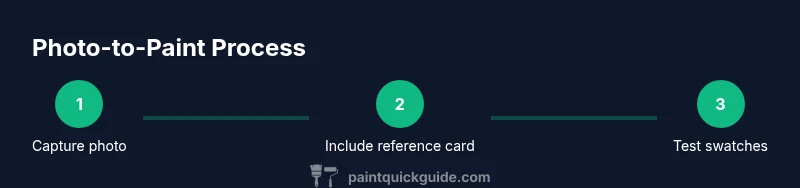
A robust color-matching workflow relies on reference tools that anchor the photo to real-world colors. Use a neutral gray or white balance card in every shot, and include a color reference card (such as a ColorChecker) or a standardized fan deck in the frame. PaintQuickGuide recommends pairing digital references with physical swatches to avoid relying solely on screen color. In practice, capture the reference card next to the surface you’re matching, then compare the sample against a swatch or paint chip under the same lighting. This cross-check is essential for reliable results.
How to photograph for best results
To improve accuracy, photograph with the subject filling the frame and the reference card clearly visible. Use natural daylight whenever possible, or a daylight-balanced lamp if daylight isn’t available. Keep the camera steady (a tripod helps) and avoid harsh shadows or specular reflections on glossy surfaces. Shoot from multiple angles and take bracketed exposures if your camera supports it. Place a swatch or fan deck next to the photographed area to create a mental anchor for your comparison. This approach makes it easier to translate the photo into an actual paint choice later.
How to translate a photo into a paint formula
Once you have a photo with a sturdy reference, identify the closest base color in a color fan deck or swatch set. Note the undertone (cool, warm, neutral) and the finish you want (matte, satin, eggshell, gloss). Use color-matching software or apps to generate a base match, then test with small paint samples. Remember that the finish and undercoat will impact the final appearance, so plan to adjust for sheen and substrate. The goal is a credible starting shade you can refine with real swatches.
When a photo-based match is good enough
For minor touch-ups, accent walls, or quick refreshes, a photo-derived shade can be perfectly adequate, especially when you test with swatches on site before buying large quantities. For high-stakes projects—large walls, exterior surfaces, or areas with color-critical requirements—a physical match using a fan deck and test pots remains the gold standard. Always review the final result under the actual lighting conditions where the paint will live. PaintQuickGuide emphasizes using test pots to confirm water resistance, adhesion, and color stability over time.
Practical workflow: from photo to paint
A practical workflow aligns digital reference with physical testing. Start by photographing under neutral light with a reference card in frame. Calibrate your screen and, if possible, export a color profile for consistent viewing. Translate the photo into a base color using a color-matching tool, then select a few swatches to test with small pots. Apply them on a sample board and compare under the same lighting as the finished space. Iterate until you find a shade that matches in real life across lighting changes. The process minimizes risk and yields a reliable result.
Tools & Materials
- Color reference card (ColorChecker or equivalent)(Essential for color calibration in room lighting)
- Neutral gray or white balance card(Helps normalize scene lighting and reduce color drift)
- Daylight-balanced lighting or reliable daylight source(Use for consistent shooting conditions)
- Camera or smartphone with manual controls (RAW preferred)(RAW preserves more color data for accuracy)
- Color fan deck or standard paint swatches(For translating photo tones into real paint codes)
- Small ruler or scale for reference(Helpful for relative size comparisons in photo)
- Note-taking device or color-matching app(Record chosen base color, undertone, and finish)
Steps
Estimated time: 1-2 hours
- 1
Define the goal and workspace
Clarify where the color will be used and what finish is required. This frames the matching approach and helps select appropriate swatches later.
Tip: Write down the exact room or object where color will be applied to avoid ambiguity. - 2
Prepare reference tools
Set up your ColorChecker, gray card, and a lighting source in the shooting area. Ensure cards are clean and unobstructed.
Tip: Check that the reference cards are not aging or stained, which can skew results. - 3
Photograph under neutral light
Capture the surface with the reference cards included, ensuring even lighting. Shoot from multiple angles for redundancy.
Tip: Keep the camera steady; use a tripod if available. - 4
Calibrate your image
Use photo-editing software to apply a color profile based on the reference cards. Normalize white balance across shots.
Tip: Save a duplicate of the raw photo before editing in case you need to revert. - 5
Identify candidate base colors
Browse your color fan deck to locate base hues that resemble the photographed surface. Note undertones.
Tip: Choose at least 3 close matches to test next. - 6
Order or test swatches
Obtain small test pots of the chosen matches and apply to a labeled test panel.
Tip: Label with color code, finish, and location for later comparison. - 7
Compare under real conditions
Evaluate the swatches in the actual room lighting and with the mounted surface at different times of day.
Tip: Use the same lighting you described in step 1 for consistency. - 8
Refine color with testing
If none are perfect, adjust subtly (undertone, lightness) and retest with new swatches.
Tip: Document adjustments so you can repeat the process later. - 9
Finalize and document
Record the chosen shade, finish, and any primers or sealers used. Keep a reference for future touch-ups.
Tip: Create a small card with the final color name and code for easy reordering.
Your Questions Answered
Can you get an exact paint match from a photo?
No. Photos provide a useful starting point, but lighting, camera, and surface finish typically prevent an exact match. Use photo-derived shades as a guide and verify with physical swatches.
Photos are a starting point, not a guarantee. Always verify with swatches in real lighting.
What tools help improve accuracy when matching from a photo?
Color reference cards, neutral gray cards, consistent lighting, and a physical paint fan deck or swatches improve accuracy when translating photos to paint shades.
Use reference cards and swatches to keep color on track.
Can lighting changes affect color matches over time?
Yes. Different light temperatures and aging bulbs shift perceived color, which means a shade may look different in daylight vs. indoors.
Light matters. A shade can drift with lighting changes.
Should I trust a store mix based on a photo?
Usually not without testing. Have a swatch or test pot created from the photo-derived shade to confirm it matches the space.
Test first—don’t rely on photo-only accuracy.
Are professional color-matching services available for photo-based requests?
Yes. Many stores offer color matching using dedicated devices and reference cards to translate a photo into a reliable shade.
Professional color matching helps translate photos into real-world paints.
What finishes affect color perception even with a good match?
Sheen level and primer can change how a color reads on a surface, so always test under finish you intend to use.
Finish changes color appearance; test with the final sheen.
Watch Video
Quick Summary
- Know that photos are guides, not guarantees.
- Use reference cards to anchor color decisions.
- Calibrate displays and cameras for consistency.
- Test with swatches before ordering large quantities.
- Document results for repeatable color matching.