How to Match Paint Color
Master color matching for walls, furniture, and cars with practical sampling methods, lighting checks, and a clear workflow from PaintQuickGuide to achieve consistent, durable finishes.

You will learn practical methods to accurately match paint color across surfaces—walls, furniture, and automotive finishes—by sampling, measuring, and comparing under true lighting, then adjusting formulas to reach a near-perfect, durable finish. This step-by-step approach uses common tools, documented measurements, and real-world testing to ensure repeatable results. PaintQuickGuide shares actionable strategies you can apply today.
Understanding why color matching matters
Color matching matters for many reasons: it ensures visual harmony across spaces, maintains resale value, and reduces the risk of awkward mismatches that draw attention. Whether you're repainting living walls, refinishing kitchen cabinets, or touching up a car's body, a careful color match saves time and material costs in the long run. The goal is not to guess, but to create a controlled process that yields a stable, repeatable result.
According to PaintQuickGuide, lighting, surface texture, and the base paint's undertones can dramatically alter perceived color. A color that looks perfect on a small swatch under daylight can drift when applied to a textured wall under artificial light. This is why color matching is as much about measurement and documentation as it is about taste.
Begin with a plan: define the target surface, gather existing colors, and set a lighting standard. Document every color value and inch of surface you will repaint. With a disciplined approach, you can reproduce a color consistently, even across batches or different brands.
Color theory basics for practical matching
Color matching relies on understanding how light interacts with pigment. Under the same lighting, warm undertones (yellows and oranges) can shift a cool blue toward green, while red undertones may make a gray appear warmer. For most home projects, focus on three concepts: undertone, value (lightness vs darkness), and chroma (saturation). By separating these elements, you can communicate the target color more clearly with swatches and mixing formulas. A practical rule: start with a base color closest to your target and adjust in small increments to correct undertones without overcorrection. PaintQuickGuide emphasizes documenting each adjustment so you can reproduce the result later.
Sampling surfaces: swatches, chips, and real-material tests
Swatches and paint chips are the starting point for color matching, but tests on the actual surface matter most. Collect multiple swatches representing the target, then compare them against the real surface under controlled lighting. For textured surfaces, apply a small patch of paint on a cardboard or MDF panel that mimics the surface texture. Record the lighting conditions, time of day, and surface finish. The goal is to observe how texture, gloss level, and adjacent colors influence perception, then translate that understanding into your mixing formula.
Lighting: the hidden factor that changes perceived color
Lighting is often the biggest variable in color perception. Daylight (D65) is the standard reference, but interiors rely on artificial lights with different color temperatures. Warm lamps (2700-3000K) can shift colors toward yellow, while cool LEDs (5000K-6500K) can emphasize blues and grays. To reduce metamerism (apparent color differences under different lights), check color samples under multiple light sources: daylight, ambient room lighting, and task lighting. PaintQuickGuide recommends a consistent light source when evaluating color and documenting color values for future touch-ups.
Tools and materials that make matching easier
A practical color-matching kit includes a digital colorimeter or spectrophotometer, a wide fan deck or swatch book, clean rags, painter’s tape, mixing containers, stir sticks, and a dedicated workspace. You should also have a neutral gray or white reference card to compare color neutralization, plus a small flashlight with high CRI lighting to evaluate under real-room conditions. Keep a color log that records the base, tint percentages, and the exact surface being matched. This discipline reduces drift across batches and brands.
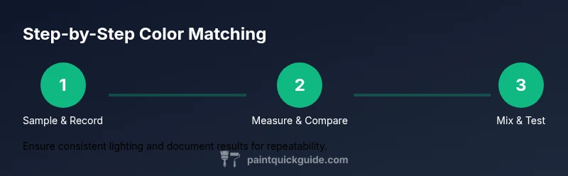
The step-by-step workflow you can follow
- Start with a precise target: identify the exact surface, finish, and lighting conditions you will use for final evaluation.
- Prepare your tools: assemble swatches, a colorimeter, and clean surfaces to measure color accurately.
- Take color measurements: measure the target color and the surface color separately, noting undertones and brightness.
- Create mixed samples: mix base paint with small tint amounts to approximate the target, testing on a controlled substrate.
- Compare and adjust: compare your sample to the target under the chosen lighting; adjust in small increments until the difference is minimal.
- Validate in real conditions: test the color on the actual surface and under different lighting moments to confirm stability.
- Document outcomes: record the exact mixes, ratios, and surface conditions to reproduce the result reliably in the future.
Color management: recording values, building a library
A color library stores target colors, formulas, and related notes. For each color, capture: target color values (in a standard color space like sRGB or CIELAB), base paint used, tint recipe, surface type, gloss level, batch number, and lighting conditions. Maintaining a consistent naming convention makes it easy to locate colors later and prevents accidental rework. Regularly review and prune your library to keep it practical and accurate.
Testing across finishes and times
Color changes with finish. A flat, matte, satin, or gloss topcoat can alter perceived color slightly due to specular reflections and depth of color. Always test color on the final finish and carry out tests across different times of day. If possible, apply a full coat on a test panel and let it cure fully before final judgment. This ensures the color you select survives day-to-day wear and lighting shifts.
Common mistakes and how to avoid them
- Over-reliance on digital color tools without real-surface tests: always test on the actual surface.
- Ignoring lighting variability: evaluate under multiple light sources and times.
- Skipping documentation: without records, recollection fails and repeat results are unlikely.
- Rushing mixes: color adjustments should be incremental; big jumps yield obvious mismatches.
- Not considering finish: always plan for the final sheen and texture when matching color.
Case studies and final checklist
A practical case shows how a kitchen remodel required matching a refrigerator panel to adjacent cabinetry. The process used a colorimeter, multiple swatches, and a patch test on the actual panel. The final result matched under daylight and warm interior lighting after two rounds of small adjustments. Checklist: define surface, calibrate tools, sample, compare under chosen lighting, mix incremental, test on real surface, document, and re-check in different lighting.
Tools & Materials
- Digital colorimeter or spectrophotometer(For objective color measurements (CIELAB values preferred))
- Wide color swatches / fan deck(Include neutral grays and undertone swatches)
- Clean cloths and lint-free wipes(For swatch cleaning and panel prep)
- Painter's tape and masking paper(To protect areas during testing)
- Mixing cups, stirring sticks, and a small scale or syringe(Precise tinting is essential)
- Base paint samples and tint colors(Keep cataloged by batch and color value)
- Neutral reference card (gray/white)(For neutral color comparisons)
- Lighting with good CRI (≥90)(Evaluate samples under consistent lighting)
Steps
Estimated time: 1-2 hours
- 1
Define the target surface and finish
Identify the exact surface you will match (wall, cabinet, or car panel) and the intended finish (flat, eggshell, satin, gloss). Document the lighting conditions and time of day you’ll use for evaluation to avoid later drift.
Tip: Write down your target surface details and keep the note with the color log. - 2
Prepare tools and clean the surface
Gather swatches, the colorimeter, and paints. Clean the surface to remove grease, dust, and fingerprints that can alter color readings.
Tip: Use a mild cleaner and a lint-free cloth to ensure a true reading. - 3
Take initial color measurements
Measure both the target color and the surface color with your colorimeter, recording CIELAB or sRGB values for reference. Note undertones and brightness differences.
Tip: Take multiple readings in different spots and average them for accuracy. - 4
Create a small set of test mixtures
Mix base paint with tiny tint increments to approximate the target. Prepare several samples that represent slight shifts in undertone and value.
Tip: Label each sample clearly with the tint percentages and base color. - 5
Compare on a test panel under controlled lighting
Apply each sample to a neutral test panel and compare to the target color under daylight and room lighting. Record which sample aligns best.
Tip: Use a neutral reference card to avoid color bias. - 6
Iterate with small adjustments
Fine-tune the best match by adjusting small increments (1-2% tint) and re-evaluating. Allow enough time for the paint to cure if color shifts occur.
Tip: Small adjustments prevent overcorrection. - 7
Test on the actual surface and finish
Apply the chosen mix to a small area of the real surface, then let it dry. Re-check under the final lighting setup and among neighboring colors.
Tip: Compare after drying to account for depth and gloss effects. - 8
Document results for future touch-ups
Log the final formula, surface type, finish, batch numbers, and lighting conditions. This ensures repeatable results on future jobs.
Tip: Keep a digital or physical color library for quick reference.
Your Questions Answered
What is the first step to color matching?
Define the target surface and finish, then gather tools and set a consistent lighting standard before measurements begin.
Start by defining the surface and finish, then assemble your tools and set consistent lighting for measurements.
Can digital color matching tools be trusted alone?
Digital tools provide a good starting point, but always verify with real surface tests under controlled lighting and document results.
Digital tools are helpful, but always verify with real tests under proper lighting.
How should I test color in room lighting?
Test colors under daylight, ambient room lighting, and task lighting. Record which lighting matches best and use those conditions for final decisions.
Test the color under daylight and room lighting and pick the best match under the real conditions.
What if the color looks different after finishing?
Re-evaluate the finish type (gloss level) and lighting, then adjust if needed. Small refinements after curing are common.
If it looks off after finishing, check the finish and lighting and adjust in small steps.
How do I save color formulas for later?
Document base color, tint ratios, surface type, finish, and batch numbers in a color log. Reference it for future touch-ups.
Save the exact formulas and surfaces in a color log for easy future re-use.
Watch Video
Quick Summary
- Plan before you mix to prevent drift.
- Test on real surfaces under multiple lights.
- Document every value and batch for repeatability.