What Paint Undertones Go Together: A Practical Guide
Learn how to pair paint undertones for cohesive rooms. This guide covers warm, cool, and neutral undertones, lighting effects, testing methods, and practical palettes for home interiors.

Understanding what paint undertones go together helps homeowners anticipate how color reads on walls, trim, and cabinetry. Start with a neutral base and choose undertones that echo the room’s natural light. Test swatches in morning and afternoon sun and compare with furniture and flooring. This quick approach yields harmonious undertone pairings that translate well across spaces.
Understanding undertones and why they matter
Understanding undertones and why they matter in paint selection is essential for cohesive spaces. What paint undertones go together determines how wall colors interact with trim, cabinetry, and furniture across different lighting conditions. According to PaintQuickGuide, undertones are subtle shifts in a base color that reveal warmth or coolness and influence perceived color more than the main shade. In practice, recognizing these subtle shifts helps homeowners avoid muddy whites, pinky grays, or overly yellow walls. This section lays the groundwork for dialing in undertones with confidence, so you can communicate color intent clearly to painters, designers, and family members.
The approach here is pragmatic: identify the undertone family first, then validate it with real-world testing. By the end of this section you will know why undertones matter, which color families tend to pair best, and how to frame your tests for reliable results.
Key undertone families
Undertones generally fall into three broad families: warm, cool, and neutral. Warm undertones lean toward yellows, oranges, or golden hues, creating cozy, inviting spaces. Cool undertones skew blue, green, or violet, delivering a crisp, modern feel. Neutral undertones balance warm and cool hints, often appearing as soft taupe, greige, or steely grays. Distinguishing these families helps you forecast how a color will read on walls when paired with trim, cabinetry, and furniture. To spot undertone, look beyond the surface shade: compare swatches side-by-side with a pure white reference under natural light, then check again under indoor lighting. Consistency is key for a unified look across adjacent rooms and spaces.
How lighting changes undertone perception
Light is the ultimate undertone modifier. Natural daylight tends to reveal the true base color, while warm artificial lighting (incandescent or warm LEDs) can push a cool gray toward a warmer, honeyed note. In contrast, cool LEDs may push a warm beige toward a crisper, almost blue-gray spectrum. This means a color that looks right in the morning may feel off at night if you haven’t accounted for lighting. A practical rule is to test swatches in multiple lighting environments—north-facing rooms, sunlit walls, and rooms with overhead LEDs—and record the observed undertone under each condition. This will prevent a mismatch between your expectations and the perceived color.
Testing undertones in real rooms
To confidently choose undertones, perform controlled tests rather than relying on chips alone. Start by painting small wall sections with 3–5 nearby color options in a single room, ideally around the same area (e.g., a living room wall with adjacent trim). Place a white or gray card near the swatches to compare tonal shifts. View the samples at different times of day and with different lighting. Photograph the swatches under each lighting scenario to build a reference gallery. This documentation helps you compare colors objectively rather than relying on memory.
Pairing undertones with common color families
Not all whites or grays read the same. When pairing undertones with common color families, consider the undertone’s relation to your base color: warm whites tend to pair with creamy beiges and warm woods; cool grays work well with blue undertones and crisp whites; neutral grays or greiges are versatile partners for most furniture and textiles. For kitchens or baths, ensure the undertone aligns with metal finishes (brushed nickel, brass, matte black) and cabinetry tones. The goal is harmony: the undertone should complement the room’s overall palette without competing with furniture or fixtures.
Common mistakes and how to avoid them
Common mistakes include assuming a chip matches the wall in all lighting, failing to test in the actual room, and neglecting adjacent surfaces like trim and flooring. Another pitfall is chasing a trendy shade that conflicts with existing finishes. To avoid these issues, always test colors on-site, under multiple light sources, and next to trim, flooring, and furniture. Keep records of observed undertones and how they shift, so you can revisit decisions if a room is repainted or a piece of furniture is swapped.
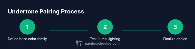
Practical workflow: a 5-step method
A simple, repeatable workflow keeps undertone testing manageable. Start by selecting 3–5 candidate base colors near your target shade. Next, test their undertones in natural and artificial light. Then, compare these undertones to adjacent surfaces like trim and floor. Narrow to 2–3 finalists and verify under different room activities. Finally, choose the best option and finalize with a single paint brand and finish. This method minimizes guesswork and yields reliable undertone pairings.
Case studies: two quick scenarios
Scenario A: A north-facing living room with cool natural daylight. A cool gray base with a subtle warm undertone reads cozy in the morning but remains crisp at night when paired with warm lighting. Scenario B: A bedroom with abundant warm LEDs. A neutral greige with a cool note can balance the warmth, preventing the space from feeling yellowish while maintaining a soft, inviting atmosphere. In both cases, testing under real conditions clarified the undertone direction before committing.
Quick palette strategies for different rooms
Living spaces benefit from undertones that read as harmonious and versatile under mixed lighting. Hallways and kitchens may lean toward cleaner whites with cool undertones to retain brightness, while bathrooms and bedrooms can embrace warmer beiges or taupes for a restful feel. Remember to consider materials—wood floors, textiles, and metal accents—and how they reflect light. The aim is a cohesive palette where undertones unite walls, floors, and furniture into a single, harmonious composition.
Tools & Materials
- Paint swatches / sample cards(3–5 shades near your target color; include a pure white reference)
- Painter's tape and scissors(For clean swatch edges and easy placement on walls)
- Color wheel or digital color tool(Visualize warm vs cool undertones and relationships)
- Multiple lighting sources(Natural daylight, LED, and incandescent or warm-white bulbs)
- White or gray reference card(Helps compare undertone shifts accurately)
- Camera or smartphone(Capture swatches under each lighting scenario)
Steps
Estimated time: 60-90 minutes
- 1
Define your base color family
Choose 3–5 target bases near your desired shade and note whether they skew warm, neutral, or cool. This sets your starting point for undertone testing and prevents drifting into unrelated colors.
Tip: Use a color wheel to map warm and cool groups before selecting swatches. - 2
Gather representative swatches
Collect swatches that sit near your target in lightness and chroma. Label each with its base color and the inferred undertone family to keep track of your reasoning.
Tip: Label each swatch with a quick note about its undertone reading. - 3
Test in real room lighting
Paint small test panels on the wall or use swatch boards placed on-site. View under natural light and under the room’s artificial lighting to reveal undertone shifts.
Tip: Take photos from the same distance to compare tone changes objectively. - 4
Compare with trims and furniture
Place swatches beside trim, flooring, and textiles. Ensure the undertone doesn’t clash with wood tones or metal finishes.
Tip: Use a white balance reference in your photos to calibrate your eyes. - 5
Narrow to a shortlist
Select 2–3 finalists that read similarly across lighting conditions and pair well with existing finishes. Schedule a final, large-scale test if needed.
Tip: Write down your observations for each finalist to avoid backtracking. - 6
Make a final choice and commit
Choose one undertone direction and finalize with a single brand and finish. Confirm once more in both daylight and artificial light.
Tip: Order a mid-size sample can if available to confirm the final choice.
Your Questions Answered
What are paint undertones and why do they matter?
Undertones are subtle shifts within a base color that reveal warmth or coolness. They influence how a color reads in different lighting and with adjacent surfaces, making undertone choice crucial for a cohesive look.
Undertones are subtle shifts in color that affect how a shade looks in light and with nearby finishes.
How can I tell if a color's undertone is warm or cool?
Compare your color swatches to a pure white reference and check against natural light. Warm undertones lean toward yellow or orange; cool undertones lean toward blue or green.
Compare it to white under daylight; warm undertones look yellowish, cool undertones look bluish.
Should I worry about undertones when choosing white paint?
Yes. Whites have undertones that shift under lighting. Pair them with adjacent colors to avoid a rainbow of hues on walls and trim.
White paints have undertones too—test with nearby trim and decor.
How many swatches should I test before deciding?
Test 3–5 near-target shades, plus a pure white reference. This provides a reliable comparison across lighting scenarios.
Test a small set of options plus white to compare undertones reliably.
Can I use the same undertone across multiple rooms?
Yes, but ensure each room’s lighting and function don't push the undertone into an unintended direction. A shared undertone helps continuity, but local lighting can shift perception.
You can reuse undertones, but re-test if lighting or use changes.
What if furniture or flooring clash with undertones?
Revisit your undertone choice by testing in the actual room, adjusting with a nearby neutral to bridge the gap.
If furniture clashes, tweak the undertone and re-test with a neutral nearby.
Watch Video
Quick Summary
- Identify undertone family before selecting color
- Test under multiple lighting conditions
- Match undertones with adjacent surfaces
- Document results for future rooms