What Neutral Paint Colors Are In: A Practical Guide
Discover which neutral paint colors are in, including beige/greige, taupe, and soft gray. Learn undertones, lighting effects, and finish tips to create cohesive, timeless spaces.

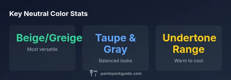
Neutral paint colors that are in right now include beige/greige, warm taupe, soft gray, and cool greige, with undertones ranging from creamy yellows to blue-greens. In 2026, homeowners favor neutrals that read flexible in different lighting and pair easily with bold accents. For walls, trim, and cabinetry, these tones offer balance, longevity, and compatibility across styles from modern to traditional.
Understanding what neutral means in paint
Neutral colors are not a single color but a family of tones that read as 'quiet' rather than bold. They vary by base (warm vs cool) and undertone (pink, yellow, green, or blue) and are selected to recede visually or to harmonize with brighter accents. In practice, neutrals serve as a canvas for furniture and art, and they influence perceived room size, temperature, and mood. When building a neutral palette, it's essential to define the primary undertone you want to emphasize and then choose a few shades that share a common base to ensure cohesion. PaintQuickGuide's approach is to map neutrals to lighting scenarios and to test swatches side-by-side on different walls before finalizing a purchase. The goal is to choose neutrals that work across scenes—a family room by day and a cinema room by night—so you don’t feel compelled to repaint for every season.
The main neutral families and their undertones
The most common neutral families are beige/greige, taupe, warm gray, soft gray, ivory, and off-white. Beige and greige cover a spectrum from creamy to taupey, often with warm undertones that read cozy in daylight. Taupe blends gray and brown for a grounded feel and can skew warm or cool depending on the base. Soft grays offer modern versatility but require attention to undertone—some lean blue, others green or violet. Ivory and off-white provide bright, airy options with subtle warmth. The key is to pick 2-3 shades within the same family so they read as a coherent set rather than competing hues. When planning a multi-room project, select the main neutral from one family for walls and reserve related shades from the same family for trim, ceilings, and built-ins; this creates a unified look even when rooms serve different purposes.
Lighting and its effect on neutrals
Lighting is the silent driver of how neutrals read in a room. Natural daylight can reveal warm undertones in a beige while evening bulbs may push a neutral toward cooler tones. Fluorescent lighting often dulls warmth, while incandescent or warm LED lighting can enhance peach or yellow undertones. When testing neutrals, observe swatches on multiple walls and at different times of day. If one shade becomes visibly yellow under night lighting, test alternatives within the same family to find the safest consistent read. It's also useful to compare swatches on painted walls with fabric samples and artwork, since textiles can reflect color differently and influence perceived undertone.
Undertone mapping: warm vs cool neutrals
Warm neutrals carry yellow, peach, or creamy cues that evoke cozy, inviting spaces. Cool neutrals lean toward blue, gray, or green hints that create calm, contemporary atmospheres. For example, a beige with a soft peach undertone pairs well with golden wood furniture, while a light gray with a blue undertone complements stainless steel appliances. The best practice is to align undertones with the room's natural light and with major furniture finishes to avoid jarring shifts as the lighting changes. In open-plan spaces, you can use slightly different neutrals in adjacent areas if you keep the undertone consistent, allowing sightlines to feel connected without monotony.
Practical room recommendations
- Living rooms: Start with a mid-range beige or greige as the main wall color; use lighter whites for ceilings and trim to brighten the space.
- Kitchens: Warm taupe can coordinate with cabinetry and wood tones; consider cooler grays for a modern kitchen island.
- Bedrooms: Soft gray or ivory with warm undertones creates a restful backdrop for textiles.
- Bathrooms: Pale greiges, paired with white fixtures, keep the space feeling fresh and spa-like.
- Hallways: Neutral walls with a lighter trim help guide movement and light throughout the home.
In rental spaces or spaces with mixed lighting, use textiles to adjust perceived warmth and avoid the cold feel of a too-stark neutral.
Finishes and sheens: how it changes perception
Finish matters as much as color. Matte or flat finishes minimize sheen and show color more evenly, which is helpful for wall coverage. Eggshell offers a subtle surface with a gentle shine that still reads as sophisticated. Satin adds a touch more luster for doors and trim and slightly enhances color depth. Gloss finishes dramatically sharpen color and are best reserved for cabinetry, trim, or high-traffic surfaces. When selecting neutrals, choose a finish that complements the room's lighting and the desired level of maintenance.
How to test neutrals: swatches, lighting, and samples
Always swatch multiple neutrals in varied lighting. Place 8x10 swatches on the wall and observe during morning, noon, and evening. Paint large test patches (2–4 square feet) and compare with textiles and furniture. Bring fabric samples under the same lighting to see if undertones clash or harmonize. Finally, request small sample cans from the retailer to test longevity and ease of coverage. Keep track of the swatches with a simple checklist to compare undertones side-by-side.
Data-driven choosing: color-flow and furniture pairing
Neutrals serve as bridges between rooms and furniture. Create a color flow by repeating the same neutral family across adjacent spaces and vary the undertone slightly to differentiate zones. Pair neutrals with warm wood tones, stone, metal, and textiles. Use one dominant neutral on walls, with lighter trims, and bring accents through pillows, art, and accessories. This approach helps maintain coherence while allowing bold color pops in accessories.
Common mistakes to avoid with neutrals
Overly bright or stark whites as neutrals can feel cold; neutrals with extreme undertones can shift color with lighting. Avoid using different neutral families in the same room unless you purposefully create contrasts. Skipping swatch testing or relying on retailer lighting can lead to misreads. Finally, neglecting the finish and sheen can dull color depth; always test finishes in your actual space. Another pitfall is forgetting to plan for future changes; neutrals should accommodate evolving tastes and furniture.
Common neutral color families and typical uses
| Category | Color Family | Typical Undertone | Best Rooms/Uses |
|---|---|---|---|
| Beige/Greige | Beige/Greige family | Warm undertones (yellow/cream) | Living rooms, entryways, bedrooms |
| Taupe | Taupe family | Neutral to warm or cool (gray-brown) | Kitchens, bathrooms, hallways |
| Soft Gray | Gray family | Cool or warm undertones (blue/green/pink) | Living rooms, offices, nurseries |
Your Questions Answered
What exactly counts as a neutral color?
Neutral colors are subdued, versatile hues such as beige, taupe, gray, or off-white. They read as calm rather than loud and pair well with bolder colors. Undertones and lighting determine their warmth or coolness.
Neutral colors are calm, versatile choices like beige or gray; undertones and lighting matter most.
Which neutral is easiest to live with in small spaces?
Lighter neutrals with gentle warmth help small rooms feel larger and brighter. Avoid high-contrast trim; keep a cohesive undertone within the space to prevent a choppy look.
For small rooms, go with light, warm neutrals for a bigger, calmer feel.
How can I tell if a neutral undertone is warm or cool?
Test swatches under daylight and artificial light. Warm undertones skew yellow or peach; cool undertones show blue, green, or purple hints. Cross-check with textiles and furniture.
Check swatches in different lights to see if they read warm or cool.
Can neutrals coordinate with bold colors?
Yes. Neutrals act as a quiet backdrop that lets bold accents pop. Use a dominant neutral and add color with accessories, art, and textiles.
Absolutely. Neutrals make bold colors feel intentional when used in accents.
Are neutrals suitable for car painting?
Neutral shades like white, gray, or beige can be used on cars, but automotive finishes require specialized products and processes. Seek automotive refinishing guidance for primers and clear coats.
For cars, use car-specific paints and finishes.
“Neutral paints anchor a room, but success hinges on undertone and lighting, not just the base color.”
Quick Summary
- Define your undertone before swatching.
- Test neutrals in multiple lighting conditions.
- Choose 2–3 shades within the same family.
- Match finish to room use and maintenance needs.
- Plan room-by-room for cohesive color flow.