Paint Like Monet: A Practical Guide for DIY Artists
Learn practical, step-by-step techniques to paint like Monet. Master light, color, and loose brushwork with affordable materials and plein-air strategies for impressionist-inspired results.

This guide helps you paint like Monet by focusing on light, color, and loose brushwork. You’ll learn a layered approach: study tonal values, mix broken color, and apply soft, rapid strokes to create atmosphere. Gather acrylic or oil paints, a selection of soft brushes, canvas, and a palette; you’ll work outdoors or indoors for plein-air effects.
Understanding Monet's Approach to Light and Color
According to PaintQuickGuide, Monet built luminous atmospheres by separating color into tiny, visible strokes rather than a smooth blend. He studied how light shifts across the scene and used broken color to suggest motion and mood. For this guide on how to paint like Monet, we’ll translate those ideas into practical steps you can apply in your own work. Start by observing a scene on a sunny day and noting where warm yellows mix with cool blues at the edge of shadow. The goal is not perfect realism, but a sense of time of day and place. By embracing painterly brushwork, you invite the viewer to feel the atmosphere rather than read every detail. As you practice, you’ll notice your color choices becoming more intentional and your brushwork more confident.
Materials that Make Monet Speak: Tools, Paints, and Supports
To paint like Monet, choose materials that respond to quick, decisive marks. Soft hog-bristle and synthetic brushes in multiple sizes, plus a few fan brushes for foliage, help you build the signature broken color effect. Use either oil or acrylic paints, with a good range of blues, greens, ochres, and yellows. Support can be canvas, linen, or primed boards; textures matter because they interact with brushwork and drying times. A pale underpainting establishes value structure before color pours on in loose layers. Finally, have a clean, accessible palette for mixing and a spray bottle to keep acrylics workable during sessions. The goal is to create luminous, atmospheric scenes rather than perfect minutiae.
Tonal Planning: Underpainting and Value Studies
Begin with a light grisaille or underpainting to lock in tonal relationships. Monet often worked from light to dark, using glazing to shift color depth without losing luminosity. In your study, mark areas of light with warm whites and cool highlights with pale yellows and blues. This stage is less about color accuracy and more about establishing where shadow and light live on the composition. By planning values first, you can layer color with confidence, ensuring that later dabs of pigment read correctly from a distance. Pay attention to the edges where light leaks into shade; soft transitions beat hard outlines for an impressionist feel.
Color Mixing: Broken Color and Limited Palettes
Monet’s color theory thrived on broken color—placing disparate hues in proximity so the viewer’s eye blends them. Start with a limited palette: blues, greens, yellows, and earth tones. Mix warm and cool variants to create the illusion of depth and atmosphere. When painting foliage or water, avoid dull greens by alternating small, bright touches of yellow and blue that your eye combines at a distance. Layer hues rather than over-mix; the sparkle of color comes from tiny, neighbor tones rather than a single smooth wash. Practice painting swatches on test panels to see how color reads under different lighting.
Brushwork and Application: Dabs, Strokes, and Edges
Use a combination of short, quick strokes and small dabs to imply texture, form, and movement. The trick is to let the edges blur slightly: hard lines tend to flatten the image, while feathered edges suggest air and distance. Vary brush sizes to capture broad shapes early, then refine with smaller brushes for highlights and focal points. Avoid overworking; Monet thrived on spontaneity and revision without over-rationalizing every stroke. Dry brushing can leave a luminous, airy feel, especially in sky and water areas. Remember to step back often and view the painting from a distance to gauge color harmony.
Composing the Scene: Plein Air vs Studio Studies
Plein-air painting forces you to respond to real light, weather, and atmosphere, which aligns with Monet’s practice. Start with quick tonal studies outdoors to capture the scene’s mood, then move to the studio to expand on color relationships. If outdoors isn’t feasible, simulate outdoor light indoors by using daylight balanced bulbs and a north-facing window. Sketch lightly first, then block in shapes with broad strokes. The goal is to convey the scene’s essence and mood rather than every detail. Rotate your vantage point to test composition and avoid a static look.
From Gradient to Impression: Glazing and Building Atmosphere
Glazing with thin, transparent layers deepens color and increases luminosity without muddying values. Work from light to dark, adding glazes of cooler blues and greens in the mid-tones to suggest depth. The atmosphere becomes richer as you glaze over the dried underpainting, while maintaining the overall light-filled feel. Avoid heavy glazing on focal areas; keep them crisp with thicker paint or scumbling to preserve texture. This approach helps you achieve that characteristic Monet glow rather than a flat finish.
Finishing Touches: Varnish, Preservation, and Realistic Look
Finish with a protective varnish that doesn’t alter color too dramatically. Opt for a satin or gloss finish depending on the painting’s surface and the intensity of color. Clean the painting’s surface with a soft brush before varnishing to avoid dust inclusion. Store the artwork away from direct sunlight and extreme temperatures to maintain the vibrancy of the layers you built. Proper framing and lighting complete the effect, enhancing how the viewer experiences the luminous, impressionistic mood you created.
Troubleshooting Common Challenges
If colors feel flat, recheck your value plan and strengthen the contrast between light and shadow. For rushed, muddy tones, slow down and dissect the scene into larger shapes first, then add color in distinct, nearby touches rather than sweeping tones. When brushwork looks stiff, switch to faster dabs and mix a fresher batch of paint to encourage spontaneity. Outdoor sessions can be influenced by wind or changing light; plan short sessions and re-evaluate after breaks to keep the scene coherent.
Authoritative Sources
- Met Museum Timeline of Art History: https://www.metmuseum.org/toah/
- Art Institute of Chicago: https://www.artic.edu
- Smithsonian Institution: https://www.si.edu
Tools & Materials
- Canvas or painting panel(Stretched canvas or primed panel sized for your study)
- Oil or acrylic paints(Choose a limited palette (blue, yellow, green, earth tones) plus any extras for glazing)
- Soft brushes (multiple sizes)(Include at least 6-8 brushes in varying widths (2-4 inch, 1 inch, detail brushes))
- Palette knives(For mixing and applying accents with texture)
- Palette or mixing surface(Smooth, level surface for easy color mixing)
- Solvent/medium (as appropriate)(Oil: shortened drying medium; Acrylic: water or medium)
- Varnish and protective spray(Choose gloss or satin depending on desire for sheen)
- Misting bottle(Keeps acrylics workable during plein-air sessions)
- Drop cloths and rags(Protect surfaces and clean brushes safely)
- Sketching tools(Graphite pencils or charcoal for quick layouts)
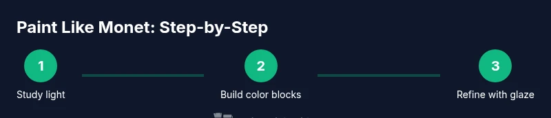
Steps
Estimated time: 3-4 hours
- 1
Set up your workspace
Arrange easel, paints, brushes, and a clean, well-lit area. Prepare a small field notebook for quick color notes and a pocket palette for mixing. Establish a routine for breaks to assess color relationships from a distance.
Tip: Keep a reference photo or scene on-hand but rely on your observation to guide color relationships. - 2
Sketch a light composition
Lightly block in the major shapes with a thin brush or graphite pencil. Focus on overall balance and where light lands; avoid detailing too early. This stage is about mapping the scene’s rhythm, not finishing details.
Tip: Use a loose grid or quick measurement to keep proportions accurate. - 3
Lay in tonal underpainting
Paint a pale, value-led underpainting to lock in light and dark relationships. Use cool blues in shadows and warm yellows in highlights to establish depth before color is added.
Tip: Keep underpainting thin so color layers below remain vibrant. - 4
Build color with broken color technique
Apply short, distinct color strokes close to each other; let the eye blend them at a distance. Don’t over-mix on the palette—contrast small blue-green touches with warm yellows for vibrancy.
Tip: Work quickly to preserve freshness of color and avoid muddy mixes. - 5
Refine shapes with loose brushwork
As forms start to emerge, switch to smaller brushes and adjust edges—softer for atmospheric planes, crisper for focal points. Maintain a sense of motion and light by alternating warm and cool touches.
Tip: Reserve the final highlights for the areas you want to draw attention to. - 6
Apply finishing glazes and evaluate
Add transparent glazes to deepen mid-tones and push the scene toward a cohesive glow. Step back often to judge color harmony and luminosity from a distance.
Tip: Avoid over-glazing in high-contrast areas; keep focal regions more saturated.
Your Questions Answered
What paints did Monet use most often and why?
Monet favored oils for their depth and blending; he relied on short, repeated strokes to build glassy light and color. Acrylics can mimic this effect with layering and glazing techniques.
Monet used oil paints for depth. You can mimic the effect with acrylics by layering short, quick strokes and transparent glazes.
Can beginners achieve Monet-like effects with acrylics?
Yes. Start with a limited palette and practice broken color techniques, quick dabs, and soft edges to emulate the impressionistic look even in acrylics.
Absolutely. Acrylics can achieve Monet-like effects with practice in broken color and loose brushwork.
Is plein air essential to Monet’s style?
Plein air exposure helps capture natural light and atmosphere, but you can study outdoors in a window or a simulated setup indoors to practice the same approach.
Plein air helps, but you can simulate it indoors if needed.
What does 'broken color' mean in practice?
Broken color refers to placing distinct, small strokes of color close together so the eye blends them at a distance, creating vibrancy without smooth blends.
Broken color is when you place small color touches that the eye blends from afar.
How do I know when a Monet-inspired piece is finished?
Finish when the mood and light feel complete; avoid overworking details. Step back regularly and assess overall harmony, not just local accuracy.
Finish when the scene feels complete and luminous; don’t overwork it.
Watch Video
Quick Summary
- Emphasize light and atmosphere over fine detail
- Use broken color to create vibrancy
- Practice rapid, loose brushwork for Monet-inspired paintings
- Balance outdoor inspiration with controlled studio studies
- Glazing adds depth without dulling the painting’s glow