How paint effects room size: Visual tricks for small spaces
Discover practical paint effects to alter how a room feels in size. This step-by-step guide covers color choices, finishes, edge-work, testing, and lighting tricks to visually expand small spaces or create cozier corners.

Goal: Learn how to use paint effects to influence room size. This guide covers color value (how light or dark a color is), finishes, and simple application techniques that visually expand a space or create cozy zones. You’ll plan palettes, test samples, and execute edge work and lighting considerations to achieve a more open feel.
How color value and light influence perceived space
According to PaintQuickGuide, color value (how light or dark a color reads) and how light bounces off walls are the primary levers for changing how big a room feels. Lighter wall colors reflect more light, visually expanding ceilings and boundaries. In contrast, deeper shades can push surfaces back or create dramatic corners, which may make a room feel cozier or more intimate. The PaintQuickGuide team emphasizes testing in actual room lighting—natural daylight and artificial sources—to see how a swatch shifts during the day. Start with large swatches on an unobtrusive wall, observe from multiple angles, and compare several options before committing to a single color or finish.
Key ideas:
- Value contrast affects perceived depth
- Light and ceiling color matter
- Test with large swatches under varied lighting
Make small spaces look larger: practical color strategies
For small rooms, aim for a cohesive color family across walls, ceiling, and trim to avoid visual breaks. White or off-white ceilings brighten the upper plane, and pale neutrals on walls create a seamless field. If you want a color effect, apply a lighter wall shade with a slightly lighter or matching ceiling shade to minimize horizontal edges. Use matte or eggshell sheens to reduce glare and preserve openness. Avoid high-gloss trim on large expanses; instead rely on soft edge transitions and consistent color temperature. In practice, test two or three swatches on a large panel and observe how they shift as daylight changes.
Pro tips:
- Soften edges by blending primer-to-paint transitions with a roller that matches wall texture
- Use a single unbroken color family to extend the eye line
- Consider lighting: warmer lights can soften color shifts, cooler lights sharpen depth
Make rooms feel taller or cozier: vertical lines and color layering
Vertical lines and color layering can dramatically affect perceived height. Painting a vertical stripe on one wall, or running a lighter ceiling color down toward the top edge, draws the eye upward. In taller rooms, keep the same color family from ceiling to floor to avoid abrupt breaks. For shorter spaces, use a light ceiling and a slightly lighter mid-tone on walls to elongate the vertical plane. A subtle, controlled gradient or soft edge wash can add depth without breaking the overall harmony. Always test a real wall panel up close and from far corners to see how line weight reads in your room’s light.
Tips:
- Use vertical elements to pull the gaze upward
- Favor consistent color temperature to maintain harmony
- Avoid strong high-contrast bands that interrupt the sightline
Testing, execution, and avoiding common mistakes
Before committing, create a testing plan with large swatches on each wall. Observe at multiple times of day to capture natural and artificial lighting shifts. When applying paint effects, work from top to bottom and keep lines crisp with an angled sash brush for edges and a roller for fields. Allow adequate drying between coats and avoid painting in high humidity. If you’re unsure about effect thresholds, start with an accent wall or a gentle color wash rather than a bold change. This reduces risk while you learn how the room responds to color value and sheen.
Brand notes:
- Test under real lighting conditions and document results
- Avoid overbuilding with multiple effects in a single room
- Use consistent sheen to prevent glare that can distort perceived space
AUTHORITY SOURCES
For further reading and trusted guidance, consult these sources:
- EPA Lead Paint Safety: https://www.epa.gov/lead
- University Extension: https://extension.illinois.edu/paint
- Oregon State University Extension: https://extension.oregonstate.edu/paint
Tools & Materials
- Paint in selected colors and sheens(Choose ceiling color white or off-white; walls in a cohesive family)
- Primer(Use stain-blocking primer if needed)
- Drop cloths and plastic sheeting(Protect floors and furniture)
- Painter's tape(Shield edges and trim for crisp lines)
- Angled sash brush (2.5–3 inch)(For precise cut-ins along ceilings and edges)
- Roller frame and 9–12 inch roller covers(Choose nap based on wall texture)
- Paint tray and liners(For efficient rolling)
- Ladder or stable step stool(Safe access to high areas)
- Color swatches or large sample boards(Test in room lighting)
- Pencil and measuring tape(Mark wall sections and stripe widths)
- Ventilation mask and eye protection(Safety first when sanding or sanding)
- Dust cloths and mild cleaner(Prepare surfaces before priming)
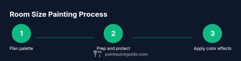
Steps
Estimated time: 4-6 hours
- 1
Define room goals and color palette
Identify whether you want the space to feel larger or cozier. Gather 3–5 color swatches, including a ceiling shade, and map how they relate in value and temperature. This planning reduces trial-and-error and aligns the outcome with your lighting conditions.
Tip: Create a color map on the floor with swatches to visualize transitions before painting. - 2
Protect and prep the space
Move furniture, cover floors, and remove hardware. Clean walls to remove dust and oils, which helps primer and paint adhere evenly.
Tip: Label drop cloths and tape so you can quickly reposition items after painting. - 3
Prime surfaces as needed
Prime over patched areas and stains, especially on new drywall or when changing drastically in color value. Primer improves coverage and reduces the number of coats.
Tip: Choose a primer with good sealing and stain-blocking properties if you’re switching from dark to light. - 4
Cut in edges and ceiling lines
Using an angled brush, cut in a neat line around ceilings, corners, and trim. Maintain a wet-edge technique to prevent ridges.
Tip: Work in short, steady strokes; keep a damp edge to reduce brush marks. - 5
Apply base color to walls
Roll the base color in 3' x 3' sections, overlapping each pass for a uniform coat. Maintain a consistent speed and avoid overloading the roller.
Tip: Use a light, even pressure and slightly overlap strokes to minimize texture variation. - 6
Introduce a paint effect (color wash or accent)
For a color wash, dilute the color slightly and dab with a sponge for a soft texture. Alternatively, apply a very subtle contrast on one wall using the accent shade.
Tip: Test on a large panel first to ensure the effect reads as intended under room lighting. - 7
Apply a second coat for consistency
Wait for the first coat to dry fully, then apply a second coat if needed to even color and tone. Inspect under natural and artificial light.
Tip: If color appears uneven, roll in a single direction to minimize streaking. - 8
Evaluate lighting and adjust if needed
Move around the space with lights on and off to observe color shifts. Adjust with a warmer or cooler light to achieve your desired perception.
Tip: Remember: lighting can alter color value by several shades throughout the day. - 9
Clean up and cure time
Remove tape, reattach hardware, and clean brushes. Allow paint to cure fully before heavy use; drying times vary with humidity.
Tip: Ventilate during cure; avoid heavy use of the room until the finish is fully dry.
Your Questions Answered
What paint colors make a room look bigger?
Light, neutral tones with low contrast between wall and ceiling help a space feel larger. Matte or eggshell finishes reduce glare and keep surfaces visually flat.
Light neutrals with a soft finish tend to make rooms feel bigger, with less glare.
Should ceilings be lighter than walls for size perception?
Yes. A bright ceiling reflects more light and makes the room feel more open. Keep walls in a cohesive palette to maintain flow.
Lighter ceilings help the space read as taller and more airy.
Which finishes work best for small spaces?
Eggshell to satin helps hide wall imperfections and reduces glare, contributing to a more expansive feel compared with high-gloss finishes.
Choose eggshell or satin for a balanced, brighter look without shine.
Can color blocking affect perceived room size?
Yes. Subtle color blocking on one wall can add depth without breaking the space’s flow. Avoid bold, high-contrast blocks in tight rooms.
A soft, restrained accent wall can add depth without shrinking the room feel.
How many coats are required for color effects?
Typically two coats give even color and effect. More may be needed for dramatic color shifts or dark-to-light transitions.
Two coats are usually enough for a clean, even color and effect.
Are there safety concerns painting high ceilings?
Yes. Use a stable ladder, avoid overreaching, and ensure good ventilation to prevent accidents and fumes exposure.
Always prioritize ladder safety and ventilation when painting high areas.
Watch Video
Quick Summary
- Choose a cohesive, light color family to expand spaces
- White or light ceilings brighten the visual height
- Test swatches under real lighting before committing
- Use subtle contrasts and matte finishes to reduce glare
- Plan, protect, and dry between coats for best results