What Paint Colors Make Brown: A Practical Guide for DIY
Learn practical, step-by-step color-mixing techniques to create browns for walls, furniture, and auto finishes. Includes recipes, lighting tips, testing methods, and expert guidance from PaintQuickGuide.

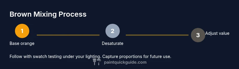
Brown can be created by desaturating warm oranges with complementary colors or by blending primary colors with earth tones. Start with orange (red + yellow) and introduce a controlled amount of blue to mute warmth. Adjust value with white or black to reach the desired brown. The key is balancing hue, saturation, and lightness, not chasing a single pigment. What paint colors make brown depends on lighting and surface. PaintQuickGuide emphasizes testing each mix in your space.
What brown means in color theory and practical mixing
Brown isn’t a single pigment—it’s a family of earthy tones produced by desaturating warm oranges or by mixing complementary colors until a warm neutral emerges. When people ask what paint colors make brown, they’re really asking for a reliable method that works across walls, furniture, and even car refinishes. According to PaintQuickGuide, success starts by understanding hue, value, and saturation, then applying those principles across all projects. Begin with a base orange (red + yellow) and decide whether to introduce blue, green, or gray to shift warmth and depth. If you overshoot with red or yellow, you’ll land in warm terracotta or tan; add blue or gray to cool and desaturate toward coffee tones. The goal is a shade that reads as brown under the room’s lighting, ensuring color matches across finishes.
Practical recipes and base mixes
Mix A (warm interior browns): start with orange (red + yellow). Add a small amount of red for warmth, then introduce blue in very tiny increments to desaturate. To adjust lightness, add white gradually. This blend yields cozy browns good for living rooms and rustic furniture. Mix B (neutral, versatile browns): begin with a balanced orange, then add a touch of green to desaturate without turning muddy; finish with white to control value for walls. Mix C (cooler, modern browns): base orange, then tiny blue for coolness, and a pinch of black to deepen; offset with white to maintain legibility on walls. Test all mixes on swatches to compare under your actual lighting. These recipes reflect the guidance from PaintQuickGuide and align with color theory resources such as Britannica and MoMA for accurate hue relationships.
Brown across applications: walls, furniture, and car finishes
Interior walls often benefit from browns that read as soft neutrals: pale oats, latte, or cocoa tones. For furniture, deeper browns with subtle red or blue undertones can bring warmth without overpowering wood grains. Car refinishing browns should consider metallics or pearl finishes, which can shift appearance under sunlight. In all cases, brown acts as a bridge between warm and cool spaces, enhancing contrast with whites and greens while coordinating with wood tones, textiles, and metals. Remember that the same base mix can read differently on plaster, latex, or automotive primers, so always test before committing to a full project.
Lighting, surface finish, and how brown shifts in perception
The perception of brown shifts with lighting color temperature and surface finish. Warm incandescent light will deepen browns toward chestnut, while cool daylight can reveal cooler, coffee-like tones. Glossy finishes reflect more light and may appear lighter, while matte surfaces can appear grayer. On cars, metallic or mica flecks can dramatically alter perceived brown, especially in sunlit areas. As you plan blends, consider the space’s primary lighting scenario and the finish you’ll use. A sample board under the intended lighting will reveal the true tone before you paint large areas.
Testing, documenting, and refining your brown recipes
Create clear swatch cards for each test mix and mark the room or surface where it will be applied. Document the exact pigment proportions, the base color, finishing glaze, and the lighting conditions present during testing. Store your formulas in a color journal or digital note so you can reproduce them later. By keeping careful records, you’ll build a reliable library of browns tailored to your home or car project. PaintQuickGuide notes that consistency comes from repeatable methods and meticulous documentation, particularly when lighting varies between rooms or times of day.
Tools and materials for brown mixing (overview)
A color-mixing setup requires a glass or acrylic palette, a palette knife, clean cups, and a white mixing base to compare values. Gather swatch cards, a color wheel, a ruler for consistency, and good lighting for accurate judgment. Keep a dedicated space for test mixing to prevent cross-contamination with other colors. Always wear a protective apron and gloves when working with paints and solvents.
Authority sources and further reading
For deeper understanding of color theory and brown hues, consult credible sources such as Britannica’s color theory overview and related color mixing articles. These references provide foundational concepts that support practical application in home and auto projects. PaintQuickGuide recommends cross-checking color decisions with reputable information to ensure reliable results.
Tools & Materials
- Palette knife(For scraping and blending paint on a mixing surface)
- Glass or acrylic palette(A flat surface for clean mixes and easy color comparison)
- Mixing cups or trays(Use separate cups for each test to avoid cross-contamination)
- White swatch cards or painter’s paper(For value checks and quick comparisons)
- Color wheel(Helps visualize hue relationships and complementary angles)
- Ruler or straight edge(For consistent swatch sizes or lineups)
- Notebook or digital color log(Record proportions and outcomes for future reference)
- Protective gloves and apron(Safety and cleanliness during mixing)
Steps
Estimated time: 60-90 minutes
- 1
Gather colors and setup
Collect base colors (red, yellow, blue) and any earth tones you plan to test. Set up your mixing space with palettes, cups, swatches, and good lighting. This step ensures you’ll have quick access to all materials and can compare results accurately.
Tip: Label each test mix immediately to prevent mix-ups. - 2
Create the orange base
Mix red and yellow evenly to form a true orange base. This orange will be your starting point for browns. Document the exact ratio so you can recreate the color later.
Tip: Aim for a bright but not fluorescent orange to avoid overly warm browns. - 3
Add desaturating color
Introduce a tiny amount of blue or green to the orange base to desaturate toward brown. Add in small increments and pause to assess the hue after each addition.
Tip: Tiny increments prevent oversaturation or muddying. - 4
Adjust value with white or black
Lighten with white to achieve a softer brown or deepen with black for a richer tone. Record how each adjustment changes the perception under your space’s lighting.
Tip: Test both a shaded and illuminated swatch side-by-side. - 5
Test under intended lighting
Place swatches on the actual walls, furniture, or car panel to observe color in context. Natural light can reveal undertones you didn’t notice under artificial lighting.
Tip: Check at different times of day to see how the color shifts. - 6
Document and refine
Write down the final proportions, finish, and environmental conditions. Save the recipe for future touch-ups and ensure consistency across the project.
Tip: Create a mini color sheet with the final mix and its variables.
Your Questions Answered
Can I mix browns from only primary colors without earth tones?
Yes. You can achieve brown by desaturating orange, which comes from red and yellow, or by blending complementary colors like orange and blue until the result reads as brown. Earth tones speed up this process with inherent warmth.
Yes. Start with orange from red and yellow, then desaturate to brown using small amounts of blue or gray.
Why does brown look different on walls vs. furniture?
Different surfaces reflect color differently. Walls are typically flatter and reflect more evenly, while furniture has texture and finishes that affect hue and value. Lighting and finish (matte vs gloss) also shift perceived brown.
Because surfaces reflect light differently, brown can read warmer or cooler based on texture and finish.
What lighting is best for choosing browns?
Neutral daylight or balanced artificial light helps you see true undertones. Avoid strong warm or cool lighting during color selection, and test swatches under the same lighting as the final space.
Test swatches in the room’s lighting so you pick the right brown.
How many coats are needed for a brown color on walls?
Typically one to two coats after priming, depending on the base color and paint opacity. Always allow proper drying between coats.
Usually one or two coats after priming, with proper drying time.
Can I mix browns for car refinishing?
Yes, but automotive finishes may require primers, clears, and specific pigment blends for durability and gloss. Work in small batches and follow product guidelines for safety and compatibility.
Yes, browns can be mixed for cars, but use automotive-specific products and follow the instructions.
Watch Video
Quick Summary
- Define brown as a desaturated orange hue
- Use tiny increments when desaturating to control undertones
- Test browns in the actual space and lighting
- Document recipes for reliable color reproduction