Color Visualizer for Exterior Paint: Step-by-Step Guide
Discover how to use a color visualizer for exterior paint to preview hues on your home, test lighting, compare palettes, and validate final colors before painting.

Use a color visualizer for exterior paint to preview exterior hues on your home before painting. Upload a photo, test palettes, and compare under daylight and dusk. See our detailed step-by-step guide to choose a tool and validate colors.
What is a color visualizer for exterior paint?
A color visualizer for exterior paint is a software tool that lets you apply virtual color choices to an image of your home's exterior. The PaintQuickGuide team found that these tools help homeowners see how a hue will look before committing to a full coat. By uploading a photo, you can experiment with color families, trim colors, and accent tones without buying paint yet. This upfront step reduces guesswork and aligns your final choice with real-world conditions like lighting and material texture. Using a color visualizer also makes it easier to share options with family members or contractors, encouraging collaborative decisions rather than one-off guesses.
Key takeaway: digital previews translate ideas into tangible visuals that are easier to discuss and approve.
Why use a color visualizer for exterior paint?
Using a color visualizer helps you avoid costly mistakes by previewing colors in context. It lets you see how your chosen hues interact with siding textures, brick, and landscaping. PaintQuickGuide analysis shows that testing colors virtually increases confidence and reduces the back-and-forth during color decisions. You can save multiple palettes for comparison and share screenshots with a contractor or HOA review board. Remember that digital previews are guides; actual paint chips should still be tested in real lighting to confirm you love the color at different times of day.
Practical note: use multiple photo angles (front, side, and any prominent feature) to ensure the color reads well from all viewpoints.
How to choose the right color visualizer: free vs paid options
There are free color visualizers built into home improvement sites and paid tools with advanced features like HDR photo support, precise color matching, and elevation rendering. Compare features such as photo upload quality, library colors, prebuilt palettes, and ability to adjust lighting. When possible, trial a free version before committing to a subscription. Paid tools are worth it if you plan multiple exterior projects over a year, especially when you need precise color matching against real paint swatches. If you’re a homeowner or DIY enthusiast, start with a free option to learn the basics, then upgrade if you anticipate future projects.
Understanding lighting and color accuracy
Color on screens can shift with display settings and ambient light. Outdoors, sunlight, shade, and time of day dramatically affect perceived color. A reputable color visualizer will let you simulate different lighting scenarios, including daylight, sunset, and overcast conditions. Always cross-check on a physical sample under the same lighting before finalizing. For auto refinishing projects, ensure the tool references common exterior finishes (matte, satin, gloss) since sheens influence color perception as well.
Tip: compare colors in both warm and cool lighting to see how the hue shifts and avoid trading off readability for looks.
Real-world workflow: preparing photos and palettes
Start with a clean photo of the exterior walls you plan to paint, including trim and doors. Calibrate your image if the tool offers it, so the perspective matches reality. Build palettes from color families you like, save your favorites, and export a report to share with others. Keep notes on why each color was chosen to justify decisions later, and tag colors by their hex or swatch numbers when you can. A practical workflow keeps options organized and speeds up the final decision.
This section emphasizes a repeatable process you can reuse across projects, such as house exteriors with multiple elevations or accessory structures that require color coordination.
Common mistakes and how to avoid them
Avoid relying on a single screenshot as final proof. Lighting changes and photo distortion can skew colors; always validate with real paint swatches. Do not ignore trim, doors, and surrounding landscape, which can reflect colors onto the main surfaces. Finally, be mindful of HOA rules or neighborhood guidelines that limit certain colors. Remember that colors selected digitally should be tested on-site with actual paint chips under typical daylight to confirm they read correctly on every surface.
How to translate digital results to actual paint shades
Translate each digital color to a real paint formula by consulting manufacturer swatches. Order small sample cans to test on a large patch on your exterior wall. Compare multiple days and lighting conditions, and ask for contractor input to confirm durability and coverage. Use the visualizer as a guide, not a final decree. If a color feels almost right but not quite, adjust saturation or lightness slightly and re-test—color rarely lands exactly on a single swatch in real life.
Authority sources
- https://www.energy.gov/energysaver/design-tips-painting-your-home-exterior
- https://www.epa.gov/lead
- https://www.nist.gov
These sources provide context on exterior design considerations, lead safety, and color measurement fundamentals that inform practical painting decisions.
Tools & Materials
- Smartphone or computer with internet access(Use any device with a web browser and camera for live testing)
- High-resolution exterior photo of your home(Capture all elevations to be painted; avoid shadows across walls)
- Color visualizer tool or app(Choose a tool that supports photo upload and lighting adjustments)
- Paint swatches or fan deck (for cross-checking)(Helpful for aligning digital colors with real pigments)
- Lighting plan or time-of-day testing schedule(Test colors in morning, midday, and late afternoon)
Steps
Estimated time: 60-120 minutes
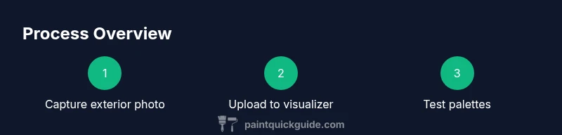
- 1
Collect exterior photos
Take high-quality photos of all elevations you plan to paint, including trim, doors, and any architectural details. Ensure even lighting and avoid harsh shadows that distort color perception. This base image will anchor your visual tests.
Tip: Take shots at multiple times of day to capture lighting variation. - 2
Choose a color visualizer tool
Browse free and paid options, focusing on upload quality, color library depth, and lighting simulators. Pick one that aligns with your project scale (single-family home vs. multi-surface updates).
Tip: Start with a free version to learn the workflow before upgrading. - 3
Upload your exterior photo
Import the image into the chosen tool and align the wall surfaces. Some tools offer perspective correction; use it to make the test results more reliable.
Tip: If the tool supports calibration, run it to match wall dimensions with real-world proportions. - 4
Calibrate the image for accuracy
Adjust white balance, exposure, and color temperature as needed. Accurate calibration minimizes color drift between digital previews and actual paint.
Tip: Document the calibration settings you used for future reference. - 5
Explore color palettes
Browse palettes by hue family (blue, gray, earth tones) and test trim and door colors against the wall colors. Save favorites and compare them side-by-side.
Tip: Group palettes that share a common undertone to simplify decisions. - 6
Test under different lighting scenarios
Simulate daylight, golden hour, and dusk views. A color can shift significantly with lighting; ensure the shortlist reads well in all conditions.
Tip: Include renderings with shade from trees or neighboring structures. - 7
Narrow to your top options
Select a short list of 3–5 colors and create a simple plan for where each color will appear (primary wall, trim, accents).
Tip: Note how color interacts with nearby materials (stone, brick, wood). - 8
Cross-check with real swatches
Order or borrow small swatches from paint brands that match the digital colors. Compare swatches under the exact lighting you plan to use on site.
Tip: Keep a color log with swatch numbers and perceived undertones. - 9
Finalize colors and plan purchase
Choose the final primary, trim, and accent colors. Create a purchase plan with quantified amounts and a timeline for applying coats.
Tip: Consult a contractor or painter to confirm coverage and durability considerations.
Your Questions Answered
What is a color visualizer for exterior paint?
A color visualizer is a tool that lets you apply virtual color choices to an image of your home’s exterior. It helps you see how colors will look in context before buying paint. Use it to compare trims, accents, and main wall colors, though always validate with physical swatches.
A color visualizer lets you preview exterior colors on a photo of your home and compare options before purchasing paint.
Can I trust digital previews to predict real-life results?
Digital previews are a guide, not a guarantee. Lighting, finishes, and camera calibration can shift how colors appear. Always test top choices with physical swatches under actual daylight before finalizing.
Digital previews guide your choices, but real-world testing with swatches is essential.
Do color visualizers account for lighting changes?
Yes, many tools simulate different lighting conditions like daylight, sunset, and overcast. Use these simulations to ensure your final color reads well across the day.
Most tools simulate various lighting so you can see how colors shift throughout the day.
Should I still test colors on physical swatches?
Yes. Visualizers reduce risk, but real paint swatches confirm appearance under actual weather and lighting. Order small cans for side-by-side comparisons.
Physical swatches confirm the final choice beyond digital previews.
Are free color visualizers sufficient for most homes?
Free tools are good to learn basics and narrow options. If you’re planning multiple exterior projects or need precise color matching, a paid option may save time and reduce errors.
Free tools are great to start; consider paid options if you need advanced features.
How do I translate digital colors to real paint formulas?
Use manufacturer swatches that match the digital colors and order small samples to test on the actual walls. Ensure the final color family aligns with the overall design and landscape.
Match digital colors to real swatches, then test on actual walls.
Watch Video
Quick Summary
- Test digitally before buying paint.
- Consider lighting when evaluating colors.
- Save and compare multiple palettes.
- Validate digital results with physical swatches.
- Account for HOA guidelines early.